 |
| .Jane. |
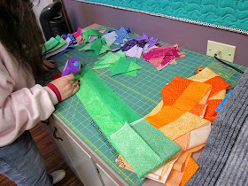
I taught the Honeycomb Waffle, Too class yesterday at
Cut Up and Quilt. It was a great lesson in choosing fabrics of different values to make an eye-catching optical illusion. Once the quilters got some blocks on the design wall, we talked about how some of the values related to others.
 |
| Susan's block layout |
 |
| Dianne cutting |
We noticed that the darks didn't always have to be the same level of darkness.
 |
| Diane K |
The mediums are the trickiest to choose: sometimes a medium could be a light or dark, depending on what the value of the other fabrics are that are paired with it.
 |
| Rochelle |
Tone on tones and batiks worked well for this quilt, but so did fabrics with more definite patterns.
 |
| Lorraine |
Some lights were really light...some were not so light. It didn't matter, as long as they related well to the other two fabrics in their set.
 |
| Dianne T |
Stripes make wonderful patterns as well as add to the design.
 |
| Susan J used one fabric that had script. |
 |
| Betty |
It was a great class and once they knew what to do, they really worked hard, getting many half blocks finished. I think that there will be some finished quilts soon.
I will be teaching this class again in March, so I asked them to bring their finished tops to show that class what they can do. (it was a thinly disguised challenge!)
 |
| Becky C |
I need to do some cleaning today, then hope to finish the new quilt that I started on retreat. Maybe I will get some inspiration while doing so and get it named! Happy Sunday!


I've run into value problems with my son's wedding quilt (your Twist & Shout pattern). What I thought was different values, turned out to be too close in value, when put together. Now I get to 'rethink' how I'm going to proceed. Oh well.
ReplyDelete